
 admin
admin

In the age of information overload, data visualization has emerged as a crucial tool for making sense of vast amounts of data. As businesses and organizations increasingly rely on data to drive decisions, the ability to effectively visualize this data is essential for unlocking its full potential. Data visualization transforms complex datasets into intuitive graphical representations, making it easier to identify trends, patterns, and insights that might otherwise remain hidden. This article explores the significance of data visualization and how it can enhance decision-making, communication, and overall business strategy.
Understanding Data Visualization
Data visualization refers to the graphical representation of information and data. It employs visual elements like charts, graphs, maps, and dashboards to present data in a format that is easy to understand and interpret. The goal is to provide a clear and concise depiction of data, enabling users to quickly grasp complex concepts and make informed decisions.
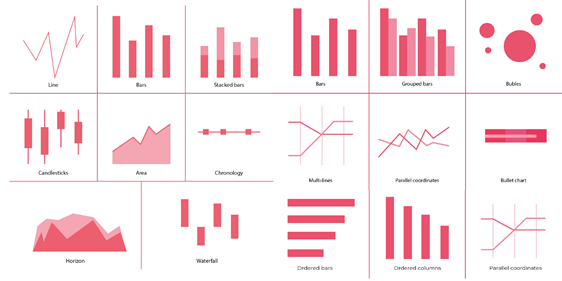
Key Components of Data Visualization:
- Charts and Graphs: These are the most common forms of data visualization, including bar charts, line graphs, pie charts, and scatter plots. Each type of chart or graph serves a specific purpose and helps highlight different aspects of the data.
- Maps: Geographic maps are used to represent data with a spatial component. Heat maps, choropleth maps, and geospatial plots help visualize data trends across different regions and locations.
- Dashboards: Dashboards consolidate various visualizations into a single view, providing a comprehensive overview of key metrics and performance indicators. They are often interactive, allowing users to explore data in more detail.
- Infographics: Infographics combine visual elements with text to present data in an engaging and informative way. They are useful for summarizing complex information and communicating it to a broad audience.

The Significance of Data Visualization
Effective data visualization plays a pivotal role in various aspects of business and decision-making. Here’s why it is so important:
1. Enhances Data Interpretation
Data visualization simplifies the interpretation of complex datasets by presenting information in a visual format. This makes it easier for users to identify trends, correlations, and outliers. For example, a line graph showing sales performance over time can quickly reveal seasonal patterns and growth trends that might be less apparent in raw data tables.
2. Facilitates Faster Decision-Making
In fast-paced business environments, timely decision-making is crucial. Data visualization enables decision-makers to access and interpret data quickly, allowing for more agile and informed decisions. Interactive dashboards can provide real-time updates, ensuring that decisions are based on the most current information available.
3. Improves Communication and Collaboration
Visualizations are powerful tools for communicating data insights to diverse audiences. They help bridge the gap between technical experts and non-experts by presenting information in an accessible and understandable way. This facilitates better communication and collaboration across teams and departments, ensuring that everyone is on the same page.
4. Identifies Trends and Patterns
One of the primary benefits of data visualization is its ability to uncover trends and patterns that may not be immediately obvious from raw data. By visualizing data, users can spot correlations, track performance metrics, and identify anomalies that could impact business outcomes. This insight is invaluable for strategic planning and performance monitoring.
5. Enhances Data Storytelling
Data visualization transforms data into a compelling narrative, making it easier to convey complex information and insights. Effective visualizations can tell a story, guiding the audience through the data and highlighting key points. This storytelling aspect makes data more engaging and memorable, which is crucial for presentations and reports.
6. Supports Data-Driven Decision-Making
Data-driven decision-making relies on the ability to analyze and interpret data effectively. Data visualization tools provide the means to explore data from different angles, test hypotheses, and validate assumptions. This support for data-driven decision-making ensures that strategies are based on empirical evidence rather than intuition alone.
Best Practices for Data Visualization
To maximize the impact of data visualization, it is important to follow best practices:
1. Choose the Right Visualization Type: Select the visualization type that best represents the data and the insights you want to convey. For example, use a bar chart for comparing categories, a line graph for showing trends over time, and a scatter plot for identifying correlations.
2. Keep It Simple: Avoid clutter and complexity in visualizations. Focus on the key message and use clear, concise labels and legends. Simple visualizations are easier to interpret and more effective in conveying the intended insights.
3. Use Consistent Formatting: Maintain consistency in colors, fonts, and styles across visualizations to enhance readability and comprehension. Consistent formatting helps users follow the data and understand the context.
4. Incorporate Interactive Elements: Interactive visualizations, such as clickable charts and filterable dashboards, allow users to explore data in more detail. This interactivity can uncover deeper insights and provide a more engaging user experience.
5. Ensure Data Accuracy: Ensure that the data used in visualizations is accurate and up-to-date. Inaccurate or outdated data can lead to misleading insights and poor decision-making.
6. Provide Context: Offer context and explanations for the data presented. Include relevant background information, sources, and interpretations to help users understand the significance of the data.
Conclusion
In the digital age, data visualization has become an essential tool for making sense of complex data and driving business decisions. By transforming raw data into clear and actionable insights, data visualization enhances interpretation, accelerates decision-making, and improves communication. Adopting best practices in data visualization ensures that data is presented effectively and used to its fullest potential. As data continues to grow in importance, mastering the art of data visualization will be key to unlocking valuable insights and achieving success in today’s data-driven world.
Popular Posts




Categories
Tags

Comments